RESEARCH, WIREFRAMES, VISUAL DESIGN
‘Swipe’ enables users to view all available JetPrivilege card with our partner banks.
‘Swipe’ enables users to view all available JetPrivilege card with partner banks. Users can get this card and earn JPMiles with every swipe made for payment using this card. Imagine if there was a mobile app for users to choose the suitable JetPrivilege card for them and apply for it online. User should be able to compare, analyse and decide which card is best for them. They should be able to take a well informed decision by understanding all benefits of a card and compare and narrow down the choice using the app.
Target Profile:

on existing associations with & role of credit cards as a category.
Geometric rise in aspirations, arithmetic rise in income - More exposure, more demands, however a slowly rising income – delayed gratification!!!
This insights were gathered conducting a small user research with my colleagues and friends.
Impatient consumers - exposed to innumerable products & services carrying the promise of an enhanced (even luxurious) lifestyle - want to covet these at the earliest
" I wanted to buy that mobile phone but then I had to wait for 2 months so that I could manage my finances well. But then, by the time I could buy that, there was a newer and more expensive version in the market.
Today, things are coming at such a fast rate that there is no point in waiting for anything.
Today people are like, if you want it, you want it now. Even I do not like to deny my family anything. "
Credit cards help bridge this income-aspiration gap (to some extent) - Credit cards, with their credit facility, help bring dreams closer (at least by 45 days)
Most consumers look upon credit cards as the window of opportunity that aids early realization of dreams
" Like we can purchase the thing before hand also. Suppose I have to purchase the thing 2 months alter then I can purchase it 1 month earlier.
If you time it right, it is an interest-free loan for a period of 45 days. So if I know that I am going to get that much cash in the next one month, then I go ahead and swipe my credit card. Then I don’t need to wait. "
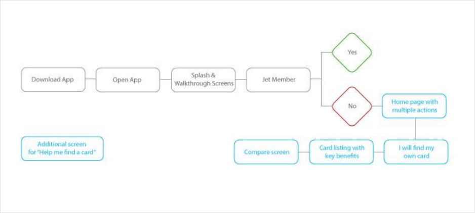
Design Thinking: Empathise, Define, Ideate, Prototype and Test. Hence due to the limited timeframe, I am going to be juggling between those.
Empathise:
This was the first stage of the my Design Thinking process to gain an empathic understanding of the problem I am trying to solve. To find out more about the concern areas, I conducted a small usability test with 3 people to understand their experiences, motivations, drives and blocks to have a deeper knowledge about the issues involved.
Define – the problem:
I put together the information gathered during the Empathise stage. Analyzed my observations and synthesized them in order to define the core problems that I have identified up to this point. To illustrate: After conducting usability test, users were experiencing lot of blockages. This insights helped me to identify the pain point of making the journey simpler and seamless by taking well informed decision.
Ideate:
With the solid background of understanding users and their needs in the Empathise stage, I analysed and synthesized my observations in the Define stage, I started generating ideas to identify new solutions to the problem statement I have created, and start to look for alternate ways to look at the problem.
Prototype:
Understanding of above steps, wireframes with solutions were then transformed into visual designs followed by clickable Prototype
Test:
Overall I am happy with the result, though I know that in a weeks time I could have done something much more detailed. But there is always room for improvement and a lot to be done to reach the fullest potential of the application’s design.
Designing with real-life content make the app more lively and helps understand the concept very well. The pages and sections sections got some real stuff in, that I took from cards.jetprivilege.com and other sites like hdfcbank.com.
One of my favorite parts of any Design process is sketching.
I had a great couple of chats with my colleagues and friends and got some great feedback on my wireframes.
So being confident with the solution, I am sketching out a rough solution on paper.
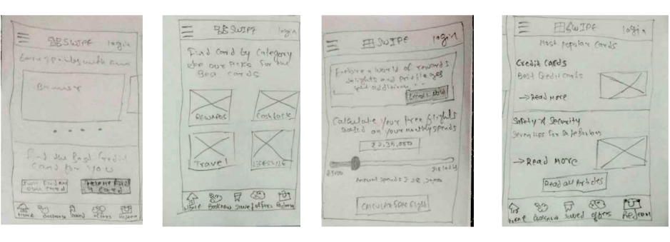
Due to time constraints, I directly started visual designs based on wireframes and insights which I got from small chats with my colleagues and friends.
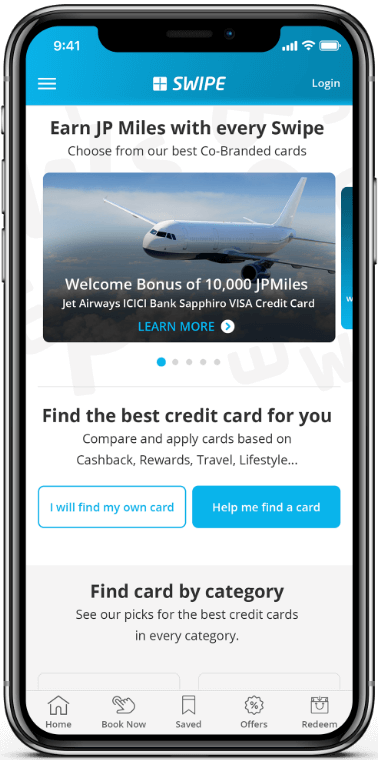
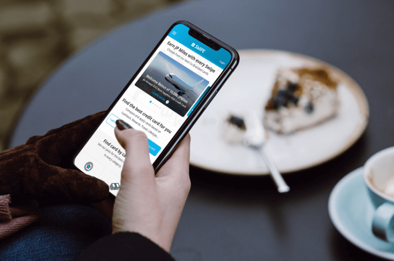
HOME SCREEN
Offer Carousel: This section will have personalized targeted offers for user basis their interaction on other sites
Find card – assisted/non-assisted:A step by step guided journey using progressive disclosure
Find card by category:Users can directly find cards basis preferences.
Enroll Now:Persuasive technique used to make users enroll
Calculate free flights:Calculator to calculate free flights
Articles:Users can read articles on how to choose a credit card, what to look while buying a card, etc…
Bottom Navigation:
Home:Current Screen
Book Now:A marketplace to book, flights, hotels, transport at the same place
Saved:User now have a flexibility to save cards to relook for future reference.
Offers:Offers would be based on e-commerce, free flights, additional points, movie tickets, vouchers, discounts, etc…
Redeem:User can now redeem points available with them at various places. Also a booklet would be provided to check all the redeemable items

LISTING SCREEN
When a user selects “ I will find my own card (un-assisted)“, they will reach to this screen where all the cards are listed with an option to filter cards:
User Action:
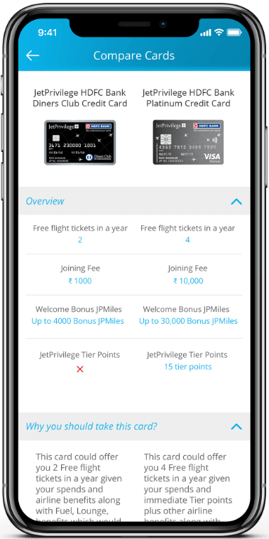
COMPARE SCREEN
Users can now select upto 3 cards to compare. Comparison is one of the most critical activities users perform on the web/app/mobile site. Most important thing to consider is to provide consistent information for all comparable products.
User Action:
https://marvelapp.com/deh0je9/screen/44393635
TO THE TOP