RESEARCH, WIREFRAMES, VISUAL DESIGN
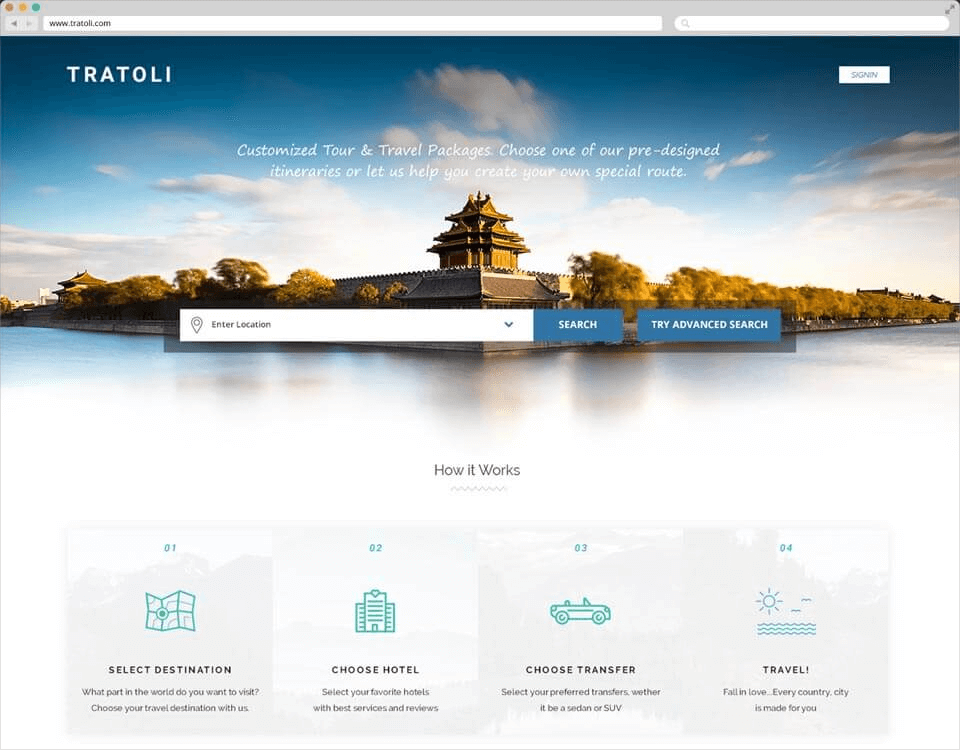
Empower traveller to discover, plan, customize and book holidays of various domestic and international destinations.
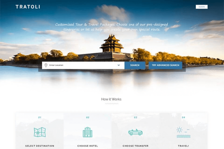
Tratoli is an India-based travel tour packages startup. The travellers who come online on Tratoli.com can choose one of the pre-designed itineraries with destinations, hotels, activities, transfers or help them create their own itineraries where they can choose destination, select best hotels with the help of reviews & ratings, choose preferred transfers & activities, then plan and finally book. From start to end Tratoli help users to make the most of their journey all in one single platform, without the need to go to various websites for booking each component of the package.
Travel marketplace is dominated by a few large players (Expedia, Cox & Kings, Yatra, Thomas Cook, Make My Trip etc.), who have built a huge brand, and continue to invest in brand awareness and reinforcement. These companies constantly reinforce their brands and play up their value offerings, by doing ads on TV and internet, promotional emails, social media. With deep investment into building brands, these companies are succeeding in luring more users (customer acquisition) to their sites, and are also playing to a traveller’s brand preference and brand loyalty.
There were two very clear challenges here: The first was competition from online booking sites (OTA – Online Travel Agencies), the second was customer acquisition, marketing and sales.
The first thing I did was conduct stakeholder interviews. It was amazing that the founder had a background in tours & travel industry offline. It was essential for me to have a very clear picture of what were the business objectives driving this project and what they were hoping to achieve. I wanted to understand the role it would play in their strategy.
I also spent a good amount of time talking to the Customer Service and Sales Teams. They provided me incredibly valuable insights regarding users actual needs.
To get some valuable user research insights, we started out talking to the actual travellers who were a genuine fit for our target audience. We found users who went for an international trips at least twice a year and domestically 3-4 times a year and did our qualitative research by asking 12 different travellers, some open ended questions like
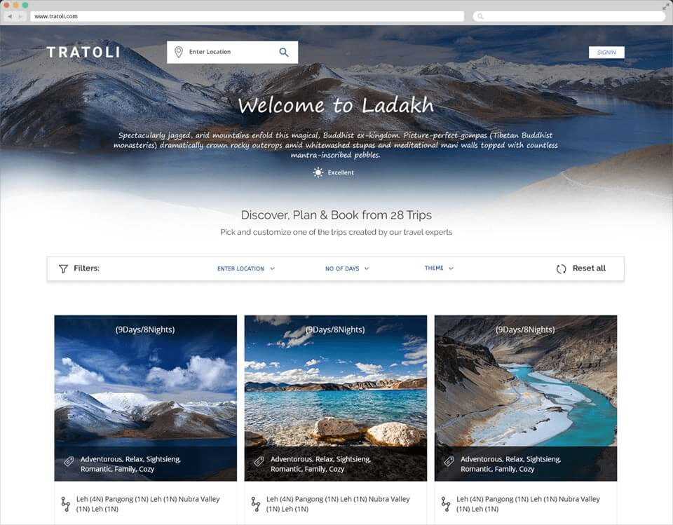
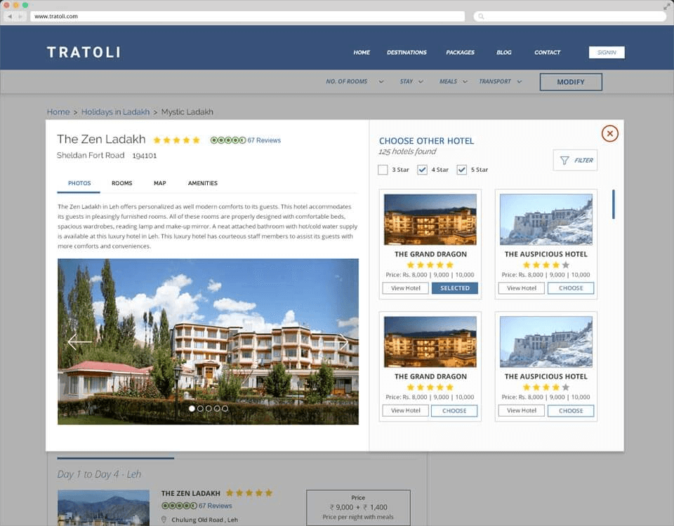
After completing the interview, we found that users needed an option to choose from different hotels by evaluating their reviews/ratings/location, transfers as per their needs or activities for a given day wise itineraries on a given date which they can sort by star rating, price, or any number of other factors. As this gives them an ease on budget while travelling to an unknown country/city.
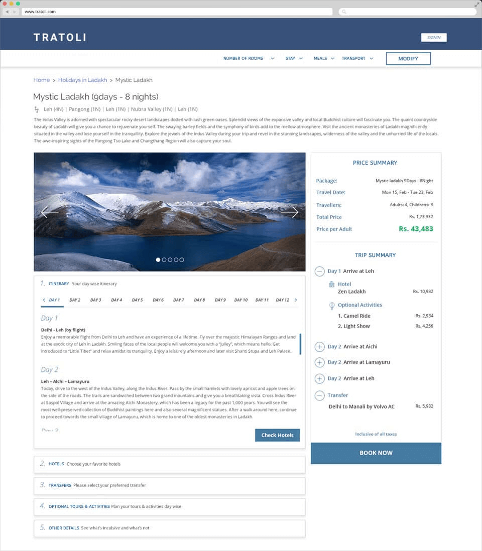
Also, users wanted to know how much they are spending on a particular hotel, transfer or an activity which makes them to stay under their budget.
Next step was creating a persona. It was created as a result of what I learned during the stakeholder interviews and talks with customers and the CS and Sales Teams, we distilled the needs and behaviours we identified into three personas, our primary persona being "Ravi Kumar" (below). It was important to have a very clear idea of whom I was designing for and it was essential for having something to go back to during the design process.
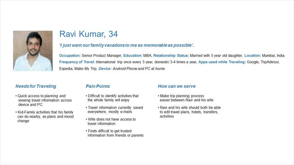
Based on the Persona’s needs and goals I translated them into a User Story to make sure the design process would have the goal “improving his workflow, with the minimum amount of friction” always in centre.
Here’s what the Persona’s story looked like:
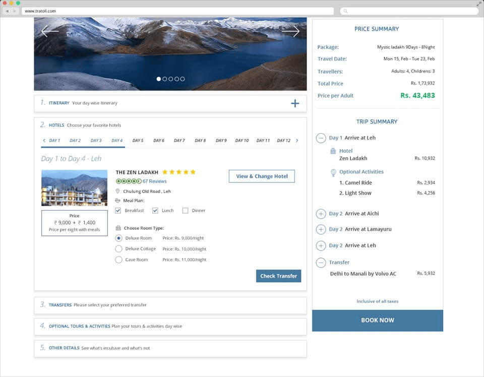
"As a traveller, I want to have clear and in-depth information about the itinerary day wise and cost of individual services and an option to share it with friends or family."
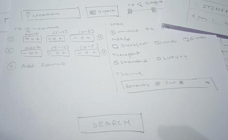
Based on the Persona’s needs and goals I translated them into a User Story to make sure the design process would have the goal “improving his workflow, with the minimum amount of friction” always in centre.The next step was to try to imagine and get it on paper how those tasks would form a UI; it was mostly trying out different design and interaction patterns until I felt a few were worth moving to the Wireframing step.

I then moved on to Visual Design. The Brand Guidelines had already been created —which colours, type, elements to use and how to use them — the task here was to combine them to enhance the overall usability, improve the experience and facilitate the user’s learning curve and adaptability.

I then moved on to performing Usability Tests with an interactive prototype. I wanted to observe how users were going through the flows and interacting with the system and whether there were friction spots or areas where I could improve or make things clearer. After conducting a few I gathered great feedback and got it in the loop.
After closing off on the designs a developer has been brought in and we worked together during the implementation. I believe in collaborating with the development team (Or, in this case, the developer) and provide very clear directions and get as close to pixel perfection as possible.
TO THE TOP